When you start your website journey, the first thing you would want to do is to know where you are supposed to go (destination) and which path to take(direction). Without clear navigation, there is a high chance that your visitors will be lost on your website and eventually leave without making any decision whatsoever.
Before we get into website navigation and the best SEO services and practices for it, you need to understand the website architecture.
Website architecture, also known as website structure, is how the pages of your website are organised. A well-structured website helps users and search engines navigate the webpages and find what they are actually looking for.
Once your website architecture is sculpted, you can then create proper website navigation for users and search engines to rank.
What Is Website Navigation
Website navigation is the series of website features and tools, such as menus, links, and buttons, to guide users on the website to move from page to page until they find the page they need or make a decision without getting confused.
Most people think website architecture and website navigation are the same; they are not. Think of website architecture as the map of the website and website navigation as the roads that users and crawlers actually take.
Why Website Navigation Matters for SEO
Having proper website navigation is crucial for any product or service-based website. Here is why:
1. User Experience Signals
A website with proper hierarchy and navigation makes users spend more time on the webpages. It is due to the fact that they understand what they are doing and engage with each website feature they find relevant, thus increasing dwell time and engagement. Higher engagement and dwell time mean lower bounce rate. This is a huge SEO metric for search engines that increases the chances of long-term organic ranking.
2. Crawling, Indexing, and Crawl Budget
Search engines find good website navigation appealing as it makes finding, reading and valuing webpages easier and more efficient. It guides bots through the site structure and ensures that the important pages get indexed while saving crawl budget for larger sites.
3. Internal Link Equity Distribution
It is the algorithmic “ranking power” that passes from one page to another with the help of hyperlinks, passing authority to those pages. Internal linking is one of the best ways to signal search engines to the relevant and important pages on the website.
4. Accessibility (WCAG compliance)
Proper site structure, sitemap, links, and good navigation enable users with visual, motor, or cognitive impairment to explore your website seamlessly. Accessible navigation ensures that assistive tools and search engine bots can both read your site easily through clean, semantic HTML code.
5. Conversion Impact
Website navigation is the direct highway to convert casual search traffic into paying customers. While SEO brings users to your landing pages through digital marketing services, intuitive navigation structure eliminates decision fatigue, reducing bounce rates and keeping visitors on the website.
Types of Website Navigation
There are different types of webpage navigation, depending on the nature of the website (product/service), the device the website is opened on, and the importance of the links.
1. Main menu
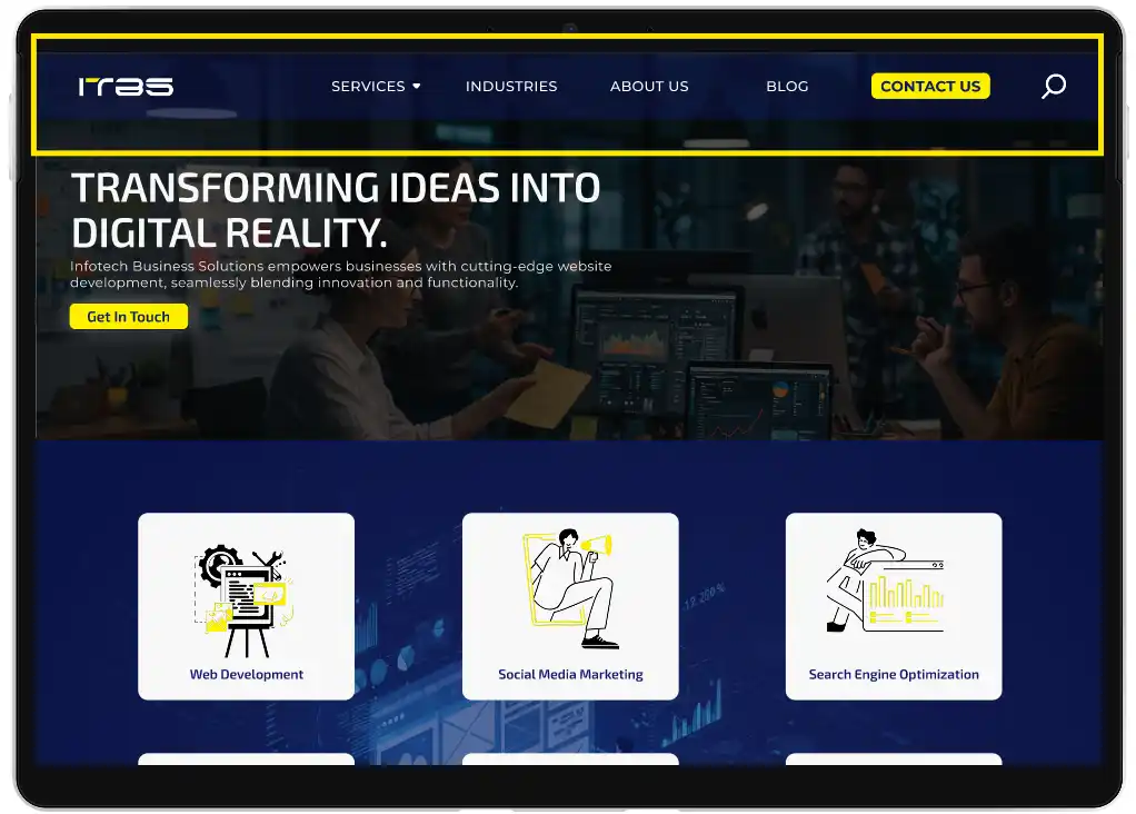
First comes the main menu: the OG “site navigation bar”. Ideally, it sits at the top of the website in the header section and includes the essential pages and links of the site.
For instance, for a service-based website, it usually includes the logo, the most important services to the left, less important links to the right, a CTA button and a search bar/icon. The search bar is included for readers who are unable to find the page they are seeking, and they can search for it directly.
For an ecommerce website, you display your main product categories with further subcategories as a mega menu or dropdown.
2. Footer Menu
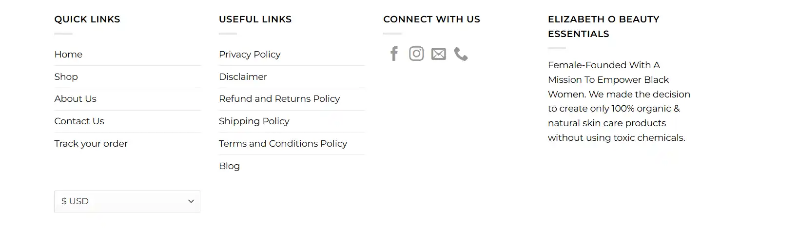
It sits at the bottom of the website, containing the pages that do not fit in the main menu or less important links of the website, such as:
- Terms & Conditions
- Policies
- Blogs
- FAQs
- Career Information
- About The Company
- Customer Support
- Social Media Pages Links
Sometimes, you can also repeat the important pages in the footer.
Most footers are in a column format with pages listed, making it easier for readers who have come all the way to the bottom to navigate to other pages without the need to scroll back up.
Elizabeth O Beauty website footer is the ideal example of a standard ecommerce website footer:
3. Breadcrumbs
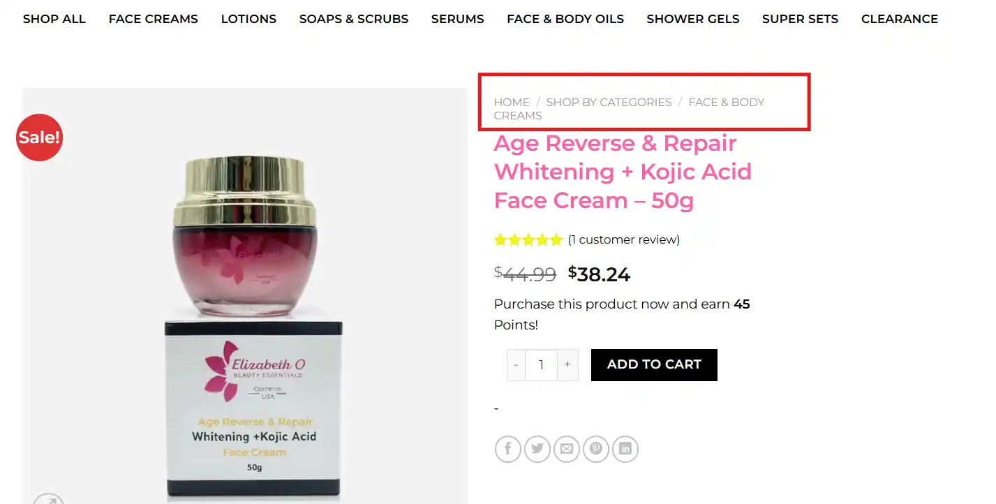
Breadcrumbs are automated internal links of a website that help users to see where they are in the site structure.
It helps users navigate without going off track, and they can hop between pages. Here is what breadcrumb navigation looks like on an ecommerce website:
4. Sidebar
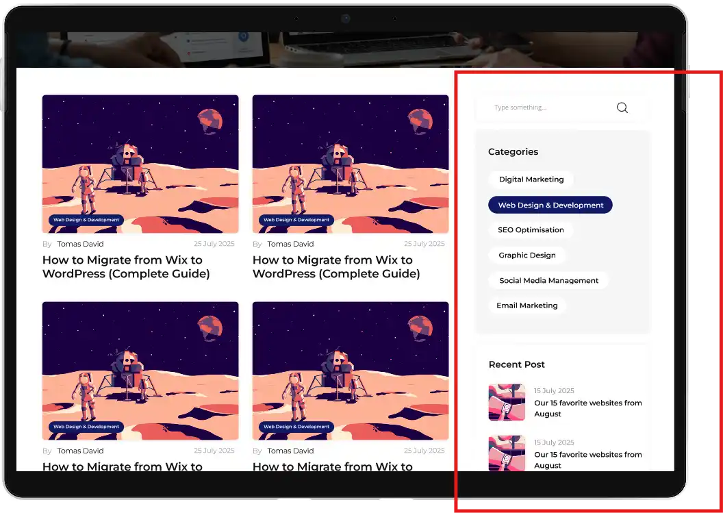
A sidebar navigation is often available to the right or left of the webpage in different appearances. It can be identified as a list of links stacked vertically, organised by topic or relevance.
This is a typical example of a sidebar navigation:
5. Tabs Navigation
It is a user interface pattern where the content is divided into multiple sections; each is accessible by clicking or tapping the labelled tabs. Most of the time, these tabs are SEO-optimised, and relevant keywords are used to help users find what they are looking for.
When a tab is clicked, one section of content appears and clicking another tab reveals different content within the same area of the page.
For instance, this is how a tabbed navigation looks in an ecommerce website:
6. Accordions
Mostly used for FAQs, Accordion navigation is a vertical collapsible menu structure that reveals content or submenus when a user clicks on the section.
It allows users to interact with the tab, open and close panels and display one or a few content blocks at a time while keeping the rest hidden.
This is what accordion website navigation looks like:
7. Dropdown
It is a great way to help users navigate your website easily. It is a navigational feature that reveals a set of sub-menu items when a user clicks or hovers over the main menu. It can be used for pages, products, solutions, or services.
The right dropdown menu keeps visitors on your site longer and makes it easier for them to find what they are looking for. Here is a video illustration of a drop-down menu for better website navigation:
8. Hamburger menu

A hamburger menu is mostly used for websites in mobile view. It is similar to a drop-down menu; however, the site hides it behind an icon that looks like a burger (☰) (where it gets its name).
It hides all the relevant information about your website in one place. When you tap it, it reveals a hidden menu or navigation drawer so that the audience can easily find what they are looking for. This is an example of a hamburger menu in mobile view:
How Users Navigate Websites
If you think users take a seat and read each line you have written on your website, that’s not it. In reality, they behave completely differently. Most users skim, hop, guess, and move on fast. Their goal is not to understand each word you have written; instead, they want to complete a task with as little effort as possible. If your design or page speed is slow, there is a high chance that they will bounce.
Here are some of the user behaviours you must know and understand to use it in your website for high engagement and a low bounce rate:
1. Scanning: They do not read; they scan.
When a user clicks on the site, they search for cues that can help them to identify the information that they need. This is because they are task-oriented, know that they do not need to read the whole thing, and scanning has always worked.
Common Scanning Patterns
- The F-Pattern: For text-heavy pages, users do a top horizontal scan, a shorter scan below, and a vertical skim on the left. The image below represents the most common scanning pattern for text-heavy pages:
- The Z-Pattern: found on clean landing pages or the hero section of a website. Users scan left, right, diagonally down to the left and to the right. It can be best used for CTAs and clean storytelling patterns.
Scanning in these patterns, users jump straight to buttons, icons, numbers, bullet lists, images, or anything that is visually strong. This phenomenon is called spot-scanning.
2. Satisficing: Users Choose the First “Good Enough” Option
We assume users search for multiple options, compare, and then choose the best one. In reality, most users satisfice; this means they choose the first thing that seems reasonable and move on with their lives.
Why, you ask?
- Most users are in a hurry when making a choice
- They do not see a lot of the cost of making a wrong choice
- Optimising and comparing takes a lot of time and effort
- Guessing seems more fun and faster
3. Muddling Through: Users Try Things Rather Than Understanding
Have you ever seen someone who uses a device incorrectly but still gets results? That is called muddling through. Most people do not get into understanding how something really works; they just want to do the task and move on.
Muddling happens when…
- Users do not read instructions and start working with the website or device
- They create their own logic of how the thing works
- They trust their intuitions more than any rules
The same happens with the website; they explore the website, see what they understand, and make a decision. If they do not understand, they leave the website quicker than you may expect.
Main Ways Users Navigate Websites
Based on these behaviours, these are the three ways that users navigate any website. And to design useful navigation that truly works, it is important to understand how users move through a site.
Forward Navigation
It happens when users move deeper into the site, step by step. For instance:
Homepage → Category → Product → Checkout.
Think of it as you walk into a house; you start from the hallway and keep exploring room by room.
Sideward Navigation
In sideward navigation, users move sideways across related sections. For example:
Users checking the category or product description, reviews, and FAQs or exploring related products.
It is like exploring rooms on one floor. Not too deep, but across.
Backward Navigation
In this way, users go back to where they came from through breadcrumbs or clicking the back button. For instance:
Clicking the back button, the homepage, or retracing steps to a previous category.
It is like walking back through the hallway or going back to revisit the earlier rooms.
SEO Best Practices for Website Navigation
By understanding all the concepts, types of website navigation, and user behaviour, you can design the best website navigation for your site that is highly optimised for SEO, long-term organic traffic and the best user experience.
Clean, Concise, & Descriptive Menu Labels
Avoid cluttering the menu with excessive information and unwanted pages. It must be clean and concise for users to read without any effort. If you see that the information and pain points are too wordy for the navigation bar, use them in the header tags.
Utilise those pain points to include relevant keywords that are searched by actual users. The keywords must be easy to understand rather than technical, so the user will not have to open another tab to search for the word.
Easy and non-complex menu navigation makes it easier for users to follow the links and reach where they need to go in as few steps as possible.
Flat Architecture and Click Depth
Keep the website architecture as straightforward as you possibly can. It keeps things simple. The fewer clicks important pages take to reach, the better the websites for both users and search engines.
“Aim for three or fewer clicks from the homepage to any page. This helps users and search engine crawlers find content faster and more efficiently.”
Aim to keep valuable content within three to four clicks from the homepage, and avoid burying pages deep in subfolders.
Watch out for orphan pages (pages with no internal linking pointing to them) as they are invisible to crawlers and users alike.
A flat, well-linked structure ensures that your site is easy to read, explore, loads faster and is crawlable for Googlebots and AI crawlers alike.
Crawlable HTML Links
Search engines rely on HTML links to discover and index your pages. If your navigation is built entirely with JavaScript or complex scripts, there is a high chance that the crawler will miss key sections of your website.
Always use clean, crawlable HTML links for menus and internal navigation. This not only improves SEO but also makes your site more accessible to users with assistive technologies.
Keep your site simple: if a human can click, a crawler should also be able to follow it.
Mobile-First Navigation Design
According to Statista.com, more than half of all global website traffic now comes from mobile phones (51.48% as of Q2 2026), and that share is only climbing. This means your navigation, design, and content strategy must be built with a mobile‑first mindset, because for most visitors, the experience starts (and often ends) on their phone.
Mobile-friendly sites with responsive navigation make it impossible for users to ignore, improving dwell time, overall engagement and conversion.
Priority-Based Menu Ordering
Your navigation bar should reflect what matters most to your business and your users. Place the most important product or service first, starting from the left, and follow the natural Z‑pattern that users’ eyes take across a page.
Less critical items can sit in the middle or be moved to the footer, where they won’t distract from key actions.
Always keep the contact button at the far right, so it’s easy to find when a visitor is ready to reach out. This simple ordering strategy makes navigation intuitive, reduces friction, and guides users toward the actions that matter most.
Current-Location Indicators
To avoid any disorientation, show users where they are in the navigation. Simple visual indicators may include underlining and/or a contrasting colour to show which page the user is actually on.
Another best way to indicate user location is through a breadcrumb list. A visual indicator in the menu is important for accessibility, so that visitors who are using keyboard navigation can use the Tab key to navigate the options in the menu.
Faceted Navigation Controls
For large ecommerce stores and content-heavy websites, faceted navigation can be the best way to navigate users properly throughout the site. It is one of the trickiest areas for SEO, and the filters and sorting options are time-consuming and confusing; however, when done right, it becomes the most powerful UX feature without doing any harm to the ranking of the website.
The best ways to implement faceted navigation controls are:
- Canonical Tags: Pointing it back to the main canonical version. It prevents duplicate content issues and consolidates ranking signals.
- Robot Directives: Using robots.txt or meta robots to block crawlers from indexing endless filter combinations while still allowing link equity to flow through.
- Parameter Handling: Configure parameter rules in Google Search Console and Bing Webmaster Tools to tell crawlers how to treat filters. This reduces crawl waste and ensures important pages are prioritised.
- User-First Logic: Keep filter URLs clean and human-readable rather than cryptic query strings. This improves both UX and shareability.
- Audit Regularly: Use tools like Screaming Frog or Sitebulb to identify parameter bloat, duplicate titles, and crawl inefficiencies caused by faceted navigation.
Core Web Vitals Impact of Navigation Elements
The navigation design you choose directly impacts your site’s performance scores, which are now a part of Google’s ranking signals. The heavier the JavaScript menus and oversized mega menus are, the slower the loading time will be, causing layout shifts, hurting LCP metrics, and increasing CLS.
To avoid this, while you outsource web development, keep the menus lightweight, use crawlable HTML links, and lock dimensions with CSS so the elements do not jump around as they load. Streamline and test the mega menus to ensure that they do not overload the page.
On mobile, responsive menus with fast tap targets are essential, since a slow or clunky menu can quickly drive users away. Regular checks with tools like Google PageSpeed Insights will highlight whether your navigation is helping or harming your Core Web Vitals.
Structuring Navigation for AI/LLM Crawlers
Modern search is not limited to Google anymore; large language models (LLMs) like ChatGPT, Claude, Gemini, and Perplexity also crawl and interpret websites. In order to make your navigation AI-friendly, it is crucial to use semantic HTML and maintain a logical hierarchy. It helps crawlers understand the relationship between pages.
Keep entity pages like About Us, Services, and Contact Us easy to find, since LLMs often reference them when citing any source.
Avoid cluttered or JavaScript-only menus that block crawlers; instead, design navigation that is human-readable and machine-interpretable. A clean and structured navigation not only improves SEO, but also increases the chances of your site being surfaced and cited by AI-driven search models.
Auditing and Tracking Navigation Performance
Website navigation is not something you set once and then forget about it. It needs to be updated and audited regularly to stay effective. Use tools like Screaming Frog or Sitebulb to crawl your site, or schedule a professional audit through our services, and spot broken links, orphan pages, or excessive click depth.
Check Google Search Console crawl stats to see how Googlebot is interacting with your navigation and whether important pages can be discovered.
Analytics platforms can also reveal how users move through menus, where they drop off, and which paths lead to conversions.
By combining crawl data with user behaviour reports, you can identify weak points in your navigation and continuously refine it for both SEO and user experience.
Common Navigation Mistakes That Hurt SEO
Not all websites get it right the first time. Here are some of the common mistakes websites make that you can check in your website navigation, spot, and fix to make your website more user-friendly as well as crawlers, eventually giving you more traffic, dwell time, a lower bounce rate and higher conversion rates.
- The menu being too busy makes it confusing and overwhelming to use and increases the chance of users bouncing back to search results.
- The menu is too sparse, meaning that key pages are not linked. Again, this leads to users not finding the content they need.
- High click depth, meaning the more clicks it takes from the homepage, the harder it is for users and search engines to find. This is not only a frustrating experience for users, but also causes search engine crawling issues.
- Orphan pages: they stand alone with no links pointing to them. It occurs when they are not linked in navigation menus or across the site. It makes it impossible for users and search engines to find the page.
- Unclickable links, like a key category page that is not clickable from the menu. They can present a problem if a user is unsure which product they need and cannot access the main category.
- Prioritising style over substance may make navigation difficult if not thought through. However, it does not mean the style has to be compromised.
Conclusion
Website navigation is more than just menus and links; it is the literal backbone of how users experience your website and how search engines understand it. Clean labels, flat labels, flat architecture, crawlable links, and mobile-first designs make navigation effortless, while technical elements like faceted controls, Core Web Vitals, and AI-friendly structure ensure long-term SEO success.
When you audit and refine your website navigation regularly, you are not just improving visibility; you are building a site that earns trust, drives engagement, and converts visitors into loyal customers. In short, smart navigation is the bridge between discovery and decision, and the key is to turn traffic into lasting growth.
When you’re ready to audit your own navigation, Infotech Business Solutions can help you turn this into a working structure.
FAQs
How can website navigation balance user experience and SEO?
It balances user experience and SEO by using a clean, logical hierarchy of the website architecture that helps human visitors find content quickly while allowing search engines to crawl and index pages efficiently. In short, balance UX and SEO by keeping menus short, using descriptive labels, implementing breadcrumb lists, maintaining shallow click depth, designing mobile-friendly navigation and avoiding JavaScript-dependent links.
What are the best practices for internal linking in navigation?
Prioritise high-value pillar content pages, use exact-match anchor text carefully using descriptive keywords, ensure all links are crawlable by using standard HTML links for all navigation elements, streamline footer navigation with secondary yet necessary pages, maintain internal links consistently across all pages of your website, and avoid overlinking pages that can overwhelm human visitors and dilute the SEO value of each individual link.
How does website navigation affect SEO rankings?
Website navigation directly affects SEO rankings by controlling how search engines find your content and how long users stay on your site. It controls crawling and indexing, distributes link authority, holds the highest authority on your site, reduces bounce rates, defines your site architecture and the relationship between pages, improves mobile indexing to rank websites, and earns sitelinks in search results.
What’s the SEO risk of faceted navigation, and how do you fix it?
Faceted navigation creates an infinite number of filtered URL combinations that exhaust your search engine crawl budget, trap web bots, and flood Google with low-value, duplicate content pages. To fix this, websites can use AJAX filtering to update content dynamically without generating new links, apply canonical tags that pass all search authority back to the core category page, and use robots.txt commands to block bots from scanning useless parameters.